let's make something fantastic.

Blog

Posts in Mammoth Fixer
Planning pt. 1: Inspiration & Layout
 

No one loves a mood board more than I do. I make them for every client, whether they want one or not. I made one for my wedding, despite the fact that my husband most certainly did not want one. (And it was gorgeous, thank you very much.) I have made mood boards for the sheer pleasure of looking at groups of beautiful, related objects. So it should go without saying that my very first step in planning The Mammoth Fixer (which shall henceforth be referred to as TMF, because blog) was creating a mood board that encapsulated my design aesthetic for this project. Being a relatively small space, it was important from the start that the whole condo felt cohesive...this goes for most spaces, irrelevant of size, but with a larger home you can get away with more when it comes to varying finishes and colors. 

A note about mood boards: these things, IMO, are meant to serve as general design inspiration, not holy gospel. For Compulsive List-Making Virgos like myself, there may be a tendency to view a mood board as a to do list that must be strictly adhered to under punishment of total self-loathing. Calm down. Mood boards are excellent tools, but only if you remember what they are for: namely, they provide a snapshot of the general look and feel you're aiming for in your design. If, once your project is all said and done, your IRL choices would fit well next to the images on your mood board, it has done its job in guiding your decision making. 

Also, mood boards provide an excellent touch-back for those moments when you're completely overwhelmed by the sheer number of decisions that must be made and you can't so much as choose a rug pad without a second opinion. In these moments, I like to look back at the mood board, reacquaint myself with the master plan, and then remind myself that no one will ever see the dumb rug pad and if I don't hurry up and make a decision no one is ever going to see this beautiful, finished condo, either. 

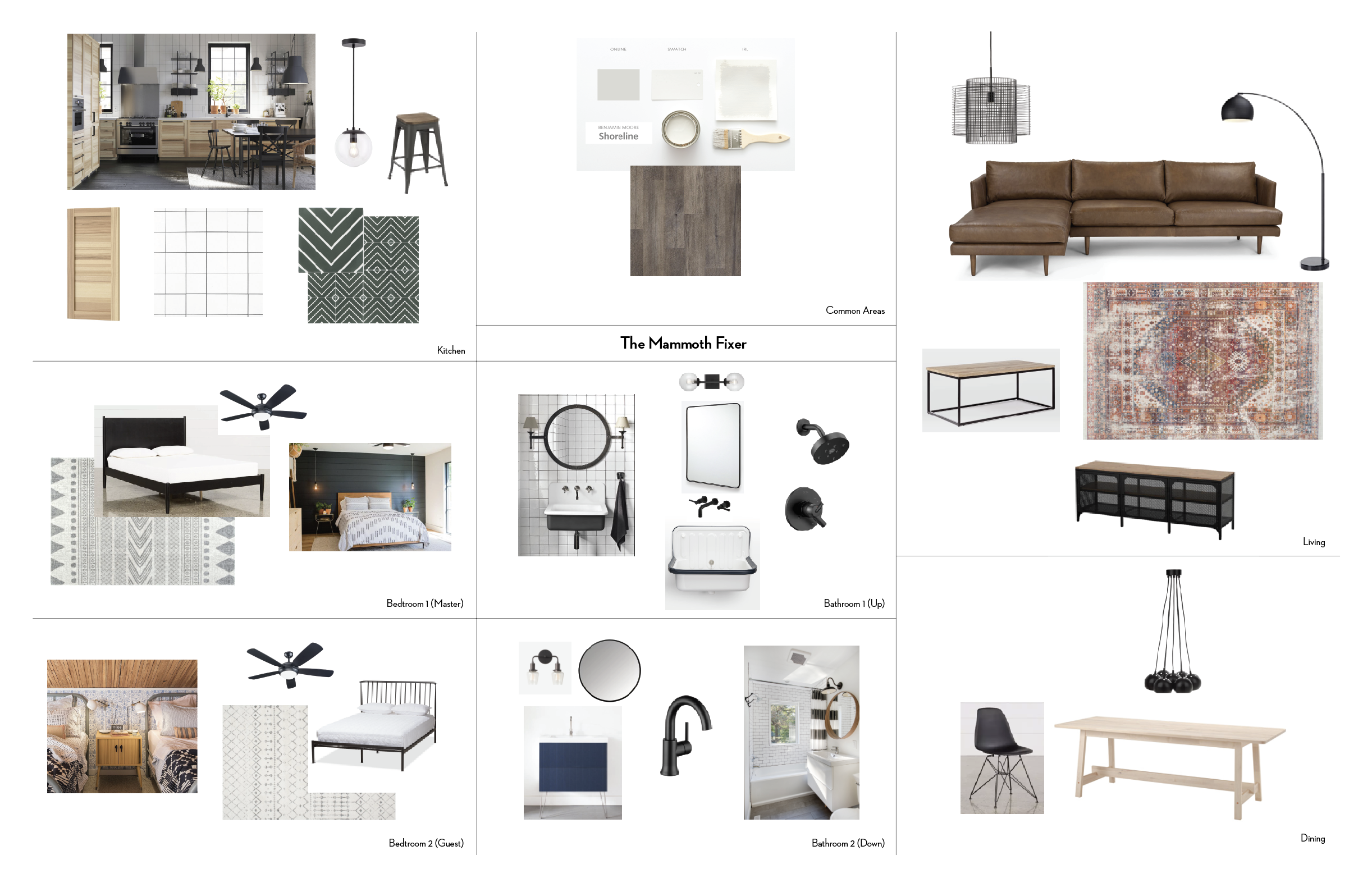
So, without further ado, I give you TMF Mood Board:

Screen Shot 2018-08-15 at 6.05.10 PM.png

I'll go into more detail regarding specific finishes and decor later, but for now I just wanted to give you (my voracious readership) an idea of the look and feel I'm going for here. The main inspiration for this mood board came from modern Scandinavian design. Peter and I have had the pleasure of traveling through Scandinavia a couple times in recent years and the warmth and practicality with which the hotels, restaurants, and homes in that corner of the world are decorated really struck a chord with me. (Super unique, I know, liking Scandinavian Design. What is this, a condo for Danish people and Ikea shoppers? Whatever IT'S MY BLOG SO GET ON BOARD.*) This style felt especially appropriate for a place like Mammoth Lakes, which has such extreme winters. Bottom line: we needed a design that was both cozy (ex. warm wood tones, mixed textiles, lots of incandescent light) and practical (ex. durable flooring that can stand up to ski boots and melting snow). I also decided to use black metal accents throughout the house which help to keep the overall look cohesive and modern.

*Get it? Like mood board?

The second step in this planning process, while not as fun to look at, is just as necessary: drawing up a floor plan. Now, I'm no Joanna Gaines (yes I'm mad about it) and therefore do not have a 3D rendering specialist on staff. My floor plan is of the good old-fashioned 2D variety. 

The worst part of this whole process was taking measurements of every single wall, doorway, and structural feature in order to get an accurate plan down on the screen. To achieve this, I attended our home inspection...the only time (to my knowledge) at which you're guaranteed to have access to a home between an accepted offer and close of escrow. No, I could not be bothered to wait until we actually owned the place to start redecorating it. And no, the 4+ hour drive both ways did not deter me in the slightest. I can't be absolutely certain, but I think it's safe to say that home inspectors don't love it when buyers decide to hang out and watch them do their job. This consideration having failed to cross my mind however, I seized the opportunity to make a brand new friend(!) by following our inspector around and pelting him with questions about the condo for the two hours it took him to do his job. Like, the whole two hours. To his credit, he was very kind and very patient, considering the fact that he had a tape-measure-wielding maniac following him from room to room like some deranged puppy.

Anyway, I digress. Here's the floor plan:

TMF_FLOORPLAN.png

Simple pimple, right?  It's amazing how much a simple scale drawing can help you plan a space. We decided before buying TMF that we wouldn't be making any structural changes (i.e. we didn't rip out any walls), so we just needed to use the existing space to our greatest advantage. A quick overview:

  • Both bedrooms are pretty square, so that made it easy to decide on layouts. Initially, we planned to build custom toe-to-toe bunkbeds above the two queen beds in the guest room, but in the end decided that it was going to make the room too cave-like...with only one small window and standard 8' ceilings, it seemed smarter to air on the side of "less is more" in order to keep this room as light and bright as possible. 
  • Upstairs in the kitchen, we extended the countertops toward the living room by about 16" in order to make room for a proper breakfast bar. We also moved the dining area over to the other end of the room in order to open up the space. A big rug and a sectional help define the living area. Finally, tucked away in the corner is a new pellet stove and normal-sized hearth to replace the old fireplace monstrosity (see previous post). 

All of these things we figured out with a lot of help from this simple little drawing. Thanks, Floor Plan! 

That's probably enough planning talk for today. More next week! 
 
Introducing: The Mammoth Fixer
 

When people ask me "what do you do?" I generally respond with a simple "I'm a freelance graphic designer. DON'T YOU KNOW WHO I AM?" Or something really friendly and approachable like that. 

These days, however, that answer only tells about half the story. Yes, I'm a graphic designer. Yes, you should probably know who I am. But as of April of this year, I've also been playing the roles of interior designer, general contractor, day laborer, carpenter, and general handyman for an exciting new project that I'm calling The Mammoth Fixer. 

A bit of back story...

In April of this year, Peter (my husband - DON'T YOU KNOW WHO HE IS, EITHER?) and I decided to buy our own little slice of heaven in the form of a badly outdated condo in one of our favorite places on earth, Mammoth Lakes, California. Mammoth is a sweet little community in the Eastern Sierra Nevada, about 5 hours north of LA and just south of Yosemite National Park. We fell in love with the town for many reasons (initially because it's home to Mammoth Mountain, a most excellent ski resort), but I'll talk more about that in a future post - please stop trying to change the subject. For now, suffice it to say that Mammoth provides an excellent escape from the hustle and bustle of Los Angeles, and we can't wait to turn this little condo in the woods into our own mountain retreat. 

Here she is in all of her Winter Glory. Built in 1966, Tyrolean Village was the 2nd condo complex in all of Mammoth Lakes. Also, how great is the name Tyrolean Village?!

Here she is in all of her Winter Glory. Built in 1966, Tyrolean Village was the 2nd condo complex in all of Mammoth Lakes. Also, how great is the name Tyrolean Village?!

As the child of Serial Home Renovators and a long-time HGTV addict, closing escrow on the Time Capsule (as we've come to refer to it) was literally a dream come true for me. As soon as I laid eyes on this beauty I just couldn't wait to tear it apart. You know, in the most loving way possible. We saw a number of other condos before we made a decision to buy, but this unit just screamed POTENTIAL before we even walked in the door. The midcentury lines of the exterior, the large south-facing windows, the high upstairs ceilings with exposed beams, and even the wood panelling (SO MUCH WOOD PANELLING) were all calling my name and begging for my attention like some needy child. And, while I would have no patience for such a child, I was more than ready to answer this old condo's siren song (is this mixing metaphors? Probably.). Luckily for me, I married a man who also saw the potential in this outdated den full of carpet and old people smell. He also trusted me to realize this potential, and immediately jumped into this project with both feet. Bless his heart. 

The Condo (as we first saw it)

I have SO MUCH to say about this project, our plans for it, and the work we're already doing, but for now I'll just share a few photos from the original real estate listings. As it turns out, I'm really bad at taking "before" photos (my natural inclination is just to dive into a project and take photos once it's nice and pretty, just like Instagram intended), so these are the only photos we have that show what this place looked like before we started tearing everything apart. 

Upstairs: looking into the kitchen from living area. Carpet everywhere. Heavy, outdated furniture that, luckily for us, CAME WITH THE HOUSE. Antlers everywhere (can you spot the two examples in this photo?) 

Upstairs: looking into the kitchen from living area. Carpet everywhere. Heavy, outdated furniture that, luckily for us, CAME WITH THE HOUSE. Antlers everywhere (can you spot the two examples in this photo?) 

A closer look at the kitchen. White appliances, wood cabinetry with a braided (?) detail, strange cabinet layout, ugly granite. Good space, but desperately in need of an update. 

A closer look at the kitchen. White appliances, wood cabinetry with a braided (?) detail, strange cabinet layout, ugly granite. Good space, but desperately in need of an update. 

Living area from kitchen. Look at all of that gorgeous panelling! I intend to make it more gorgeous. Beautiful large windows hidden behind unfortunate vertical blinds. Take a look a that platform the stove is sitting on...

Living area from kitchen. Look at all of that gorgeous panelling! I intend to make it more gorgeous. Beautiful large windows hidden behind unfortunate vertical blinds. Take a look a that platform the stove is sitting on...

A closer look at that perplexing monstrosity we came to refer to as "The Stage." This thing was (yes, *was*) taking up like 35 square feet of prime living room space. One can only assume this was built because the original owners were prone to hosti…

A closer look at that perplexing monstrosity we came to refer to as "The Stage." This thing was (yes, *was*) taking up like 35 square feet of prime living room space. One can only assume this was built because the original owners were prone to hosting rambunctious karaoke parties and needed a stage on which to perform. Also, it was original to the house, which meant it was built right into the wall. More on that later. 

Bathroom 1 of 2. Nothing, not even that lace valance, makes me more angry than the uncentered medicine cabinet and light fixture. It all must go. 

Bathroom 1 of 2. Nothing, not even that lace valance, makes me more angry than the uncentered medicine cabinet and light fixture. It all must go. 

Staircase. How much panelling can one little condo handle? (Hint: this is probably just about enough)

Staircase. How much panelling can one little condo handle? (Hint: this is probably just about enough)

Full living space. Glorious upholstery. Yet more antlers.

Full living space. Glorious upholstery. Yet more antlers.

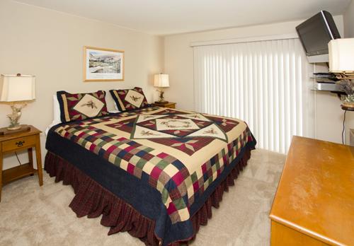
Bedroom 1 of 2. Yes, there are three lamps, and yes, they all feature more antlers.

Bedroom 1 of 2. Yes, there are three lamps, and yes, they all feature more antlers.

Bedroom 2 of 2. It's a big enough space, but it was being used strangely. No antlers here, which frankly feels like an oversight at this point. 

Bedroom 2 of 2. It's a big enough space, but it was being used strangely. No antlers here, which frankly feels like an oversight at this point. 

Blogging is exhausting and I have no idea where to quit, so I think that'll do it for now. Up next: my plan to update all of these spaces. Coming at you sometime next week!